monday.com Services
Visual project management has revolutionized how teams collaborate and deliver projects in 2025. Gone are the days when static Gantt charts could adequately represent complex workflows.
For decades, project managers relied on linear timelines and rigid dependencies. However, today's distributed teams need dynamic visual project management solutions that adapt in real-time. According to Atlassian's State of Teams 2025 report, 71% of distributed project managers now consider dynamic visualization tools essential for tracking collaboration, risk, and resources.
Modern project managers don't just need timelines—they need living maps of progress that breathe with their projects.
Why Visual Project Management Matters Now
At Creative Bits, we've spent years helping teams implement visual project management across platforms like Monday.com, ClickUp, Notion, and Asana. One thing remains clear: visual clarity drives velocity.
Whether managing product launches, design sprints, or cross-functional campaigns, the right visualization technique simplifies complexity. Let's explore seven cutting-edge approaches that leading teams use to plan, adapt, and deliver exceptional results.
1. Kanban Flow Metrics: The Pulse of Visual Project Management
Kanban boards have evolved far beyond simple task columns. Today's visual project management systems feature data-rich dashboards with real-time flow metrics.
Modern Kanban visualizations track:
- Flow efficiency rates
- Lead time analytics
- Work-in-progress limits
- Cumulative Flow Diagrams (CFDs)
According to Jira Align's Agile Trends Report, teams using Kanban flow analytics reduce delivery cycles by 28%. These metrics instantly reveal bottlenecks, stalled tasks, and patterns of team fatigue.
For distributed teams, this transparency is revolutionary. A single glance replaces endless status meetings.
Implementation Tips for Kanban Visualization
Start with platforms like Trello Enterprise or ClickUp that offer built-in CFDs. Connect these to Slack for automatic updates. We've helped startups eliminate daily standups using this approach.
2. Dependency Mapping: Seeing Connections in Visual Project Management
Modern projects are interconnected webs where one delay can cascade across departments. Dependency mapping—a crucial visual project management technique—illustrates these relationships clearly.
Gartner's survey shows 44% of project overruns stem from hidden dependencies. Visual dependency networks prevent these surprises.
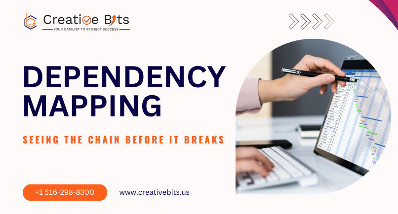
Tools like Monday.com, Work OS, and Smartsheet automatically highlight risk zones when deadlines shift. This visibility is invaluable for:
- Multi-department programs
- Merger implementations
- Large-scale IT projects
Imagine updating one sprint and instantly seeing impacts across launch and QA schedules—that's the power of dependency visualization.
3. Risk Heat Maps: Transforming Uncertainty Through Visual Project Management
Risk management has evolved from spreadsheets to visual narratives. Heat maps categorize risks by likelihood and impact, creating color-coded grids for instant comprehension.
PMI's Future of Risk Management survey reveals that teams using visual risk dashboards identify issues 37% faster than text-based approaches.
Advanced Risk Visualization Features
Modern visual project management platforms offer:
- AI-powered risk indicators
- Real-time sentiment analysis
- Automatic escalation triggers
- Monte Carlo simulation overlays
When a critical task slips, the heat map immediately flags it as "High Impact–Medium Probability," prompting early intervention.
For executives, these visualizations transform abstract risks into tangible, actionable insights. Read more about risk management best practices from PMI.
4. Resource Allocation Bubbles: Balancing Capacity Visually
Resource misalignment kills projects. Visual project management solves this through resource allocation bubbles—proportional shapes representing team workloads.
Asana's Work Innovation Index 2025 found 64% of project managers cite resource misalignment as their top challenge.

How Resource Bubbles Work
Platforms like Float and Hive visualize:
- Team capacity percentages
- Workload distribution
- Burnout risk indicators
- Reallocation opportunities
AI assistants suggest optimizations like "Shift 20% of design hours from Campaign A to Campaign B to meet deadlines."
This visual project management approach protects creative space while preventing overload. Balanced bubbles mean a sustainable pace.
5. Timeline Grids 2.0: Living Chronologies in Visual Project Management
Static Gantt charts assumed predictability. Today's timeline grids pull live data from automation systems, showing:
- Real-time progress
- Dynamic dependencies
- Velocity indicators
- Risk overlays
ClickUp's research shows interactive timeline grids increase stakeholder engagement by 53%.
Features of Modern Timeline Visualization
Advanced visual project management timelines offer:
- Hover over task details
- Live comment threads
- AI forecasting layers
- Variance color coding
These replace static reports with dynamic insights. Executives become real-time decision-makers, not retrospective reviewers.
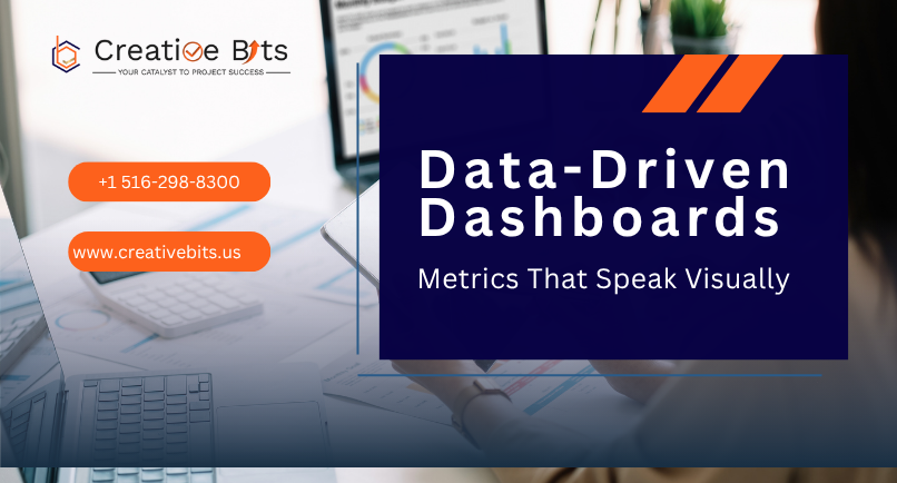
6. Data-Driven Dashboards: Metrics That Speak Through Visual Project Management
Today's project managers are data storytellers. BI-powered dashboards translate metrics into visual narratives.
Microsoft's study shows projects using real-time data visualizations achieve:
- 40% more trends identification
- 25% analysis time costs
Building Effective Dashboards
Modern visual project management dashboards track:
- Burn-down rates
- Budget variance
- Sprint velocity
- Milestone forecasts
Platforms like Power BI and Tableau offer customizable visualizations. Connect these with Zapier or Make for automation.
Remember: show the right metrics, not more metrics.
7. 3D Collaboration Spaces: The Future of Visual Project Management
Visualization is moving beyond screens into immersive 3D workspaces. Platforms like Miro 3D and Microsoft Mesh enable spatial collaboration.
Teams design workflows on virtual canvases, manipulating:
- Sticky notes in 3D space
- Dependency lines
- Resource bubbles
- Risk zones
Gartner predicts 35% of enterprise teams will experiment with 3D collaborative environments by 2026 year-end.
Digital Twins in Project Visualization
Digital twins—virtual replicas of projects—allow teams to simulate scenarios. Manufacturing teams visualize production delays. Marketing teams test rollout sequences.
This isn't gimmicky—it's the next leap in visual project management, moving from static to spatial thinking.
The Future of Visual Project Management: AI-Powered Understanding
Visual project management in 2025 combines AI with visualization to predict, not just track. Modern systems offer:
- Predictive overrun alerts
- Automated risk mitigation
- Sentiment analysis overlays
- Decision support layers
McKinsey reports organizations using AI-enhanced visualization recognize risks 50% faster and improve on-time delivery by 25%.
Implementation Strategy
Start your visual project management transformation:
- Audit current visualization gaps
- Select 2-3 techniques to pilot
- Train teams on new tools
- Measure improvement metrics
- Scale successful approaches
Transform Your Visual Project Management With Us
Projects in 2025 demand more than management—they need continuous visualization, understanding, and optimization. Visual project management unlocks this potential.
At Creative Bits, we help teams move beyond legacy tools toward adaptive visual frameworks. Our workflow architects design custom solutions, including:
- Interactive dashboards
- Resource heat maps
- Adaptive timeline systems
- AI-powered risk visualization
Ready to revolutionize your visual project management approach? Contact us to learn how visual clarity can accelerate your project velocity.
Because in 2025, successful projects aren't just managed—they're seen, understood, and continuously optimized through the power of visual project management.